Friday, March 30, 2012

color theory {color wheel}

First thing first - color is a measurement that can be viewed in many different units.  Much like temperature can be measured in Fahrenheit and Celsius.

In color we have:
RGB    <Red, Green, Blue
CYMK <Cyan, Yellow, Magenta, Black
HUE    <a degree value from within the color wheel
HSB    <Hue, Saturation, Brightness aka HSV
HSL    <Hue, Saturation, Lightness
HSI     <Hue, Saturation, Intensity
SML   <Small, Medium, Large wavelengths
PMS   <Pantone Matching System
Hex # <Hex triplet numbers are used for web color *ColorHexa is a fun website that shows the conversions of hex to rgb and cymk

And many more that I did not get into.  I mostly focused on RGB and HSB which are represented  in my diagrams. 

Second - most of you know what a color wheel is.  It has the primary and secondary colors.  Sometimes more, or even all.  Those of you who have used adobe suites or other graphic software know how many colors you can choose from.

My interest in color theory was how do I make my own color wheel using my own colors? And how do I know what colors to choose when applying those colors to my designs?

In the process I discovered a lot about color. Knowing what your going to do with it {web or print} can make a difference on what color unit you want to use.  If you produce or edit in RGB it may not have the same colors when it's printed in CYMK.  Though many programs and printers automatically convert the numbers for you.

In the past, picking a color was very arbitrary and less formulated.  Yes the primary and secondary colors have a number, but I normally wasn't looking for bright red and yellow.  Now that I've played with it, choosing a hue and working from there by adding black, white, or gray is less arbitrary than just color picking a "redish" color in the color box. When choosing colors for color palettes or color schemes, this can be less arbitrary, meaning you don't need to just pick red if you want red. You can pick many hue's close to red.  And using similar or contrasting hues and values can be a good start to picking colors for your color schemes.

All that may seem a little to color complicated but lets see if my diagrams make it a little easier to understand.


RGB {Red, Green, Blue} are the primary colors for light. When we add them together we get white. We typically use RGB for digital mediums that light goes through. Green is not a primary color, but in a RGB color wheel green is at a 120° axis. In a normal color wheel yellow is at the 120° axis <as shown above>.

When we print something we typically use CMYK {Cyan, Magenta, Yellow, Black}. When we add these together we get black. These are also the secondary colors to RGB. The color wheel above represents both RGB and CMYK colors but only denotes RGB and hue degrees.

I've also posted all of my color theory sheets on flickr  if you would like to download them.  Here are a list of my website links I used to gather my information:

Color Theory for Designer, Part I II & III
Basic Color Schemes - Introduction to Color Theory
Choosing a Monochromatic Color Palette in Photoshop
Color Tutorial
Color Theory, The Color Wheel & Color Schemes
Interactive Color Wheel

color theory {vocabulary}

The next part of color theory to understand is the vocabulary.  I find that I often use a term like, tone or shade, and don't actually know the difference.  And there is a difference.  When learning about tones I kept asking myself how do I add black, white and gray.  I knew how to add black in CMYK, but that's not how you add black to a color.  That changes the hue altogether.


I've also posted all of my color theory sheets on flickr  if you would like to download them.  Here are a list of my website links I used to gather my information:

Color Theory for Designer, Part I II & III
Basic Color Schemes - Introduction to Color Theory
Choosing a Monochromatic Color Palette in Photoshop
Color Tutorial
Color Theory, The Color Wheel & Color Schemes

Interactive Color Wheel

color theory {color palette}

Next I worked on creating color palettes.  When starting I really wanted to know how to choose colors for designs.  I knew most of these already but it really helped to lay it all out and see a more formulated way to choose.


I've also posted all of my color theory sheets on flickr  if you would like to download them.  Here are a list of my website links I used to gather my information:

Color Theory for Designer, Part I II & III
Basic Color Schemes - Introduction to Color Theory
Choosing a Monochromatic Color Palette in Photoshop
Color Tutorial
Color Theory, The Color Wheel & Color Schemes

Interactive Color Wheel

color theory {color picker}

This was also one of my inspirations for the last two weeks.  The website Design Seeds creates color palettes using photos that the designer buys from people.  I always loved the colors and palettes that she puts together and I wanted to do the same thing, but with my own photos that I have taken.  I have decided that I will add this to my weekly list of things to blog, along with a weekly project and inspiration post. 

So here is how I did it.  Using Photoshop I edited the photo and then put it in Illustrator where I used the eyedropper tool to select colors from the photo.  Then looking at the HSB levels I chose 5 colors that would work well together in a color scheme.  I was so excited about how it turned out that I quickly threw together a little icon using the colors and photo.


I've also posted all of my color theory sheets on flickr  if you would like to download them.  Here are a list of my website links I used to gather my information:

Color Theory for Designer, Part I II & III
Basic Color Schemes - Introduction to Color Theory
Choosing a Monochromatic Color Palette in Photoshop
Color Tutorial
Color Theory, The Color Wheel & Color Schemes

Interactive Color Wheel

Friday, March 23, 2012

inspiration {spring & color}

The end of the week has come!  This week has snuck by me.  I have been working on a new project but it is not ready for turnover yet.  I have been teaching myself color theory.

Many of you may think {what more is there to know than "Roy G. Biv"?}

There is tons more! I've been researching the basics and how to apply it to graphics.  I've learned the difference in the technical terms of color theory. I've expanded my knowledge of how to use Photoshop color picker. I've had a few new ideas of color for my blog. And to make it even more fun I am developing a few graphics as reminders for myself & to put what I learned into good use  - {Learn  Apply  Execute Critique - Execute Critique - EC...}  Say "execute critique" 5x.  This was basically our studio regiment with a little inspiration, lists of deliverables, and all-nighters thrown in there.

So next week I will be spending one more week at home and will have lots of time to finish up my own list of deliverables for color theory.  On top of that I've added another project to my list. I want to create my own handwriting font.  I've found a few websites that explain how to do it.  I'm quite excited about it.

In addition I have taken some photos of the sprouting greens outside!
Consider this my inspiration for the week {flickr set < sprouts of spring}


Sunday, March 18, 2012

project {renovated pants}

I've been dying to renovate a few pairs of my pants.  I bought a black pair of very comfy light weight cotton jeans from Korea. But in Korea it is not common to have a dryer to dry your clothes - you must hang them up in your apartment to air dry.  This +  I never wanted to wash my clothes, ended in my pants stretching out.  And now that I am back in the States I can't seem to dry them enough in hopes that they will shrink to a smaller size.  

Keep in mind these are my favorite pants and only cost 3 US dollars and every time I wear them Andrew looks at me like "don't you have any other pants that will fit you?" - And so I am left with having to experiment on my favorite pants and hope that I can successfully take them in all by myself.  I did google/youtube for some help.

first I organized and cleaned out my mom's sewing kits {and junk} of 25 years to procrastinate time


Based on my youtube research:
I      {put your pants on inside out}
II     {with white chalk, mark where you want the new seam to be}
III    {using a ruler and a good eye of symmetry connect the lines into one continuous white line that you will follow when sewing}
IV   {pin the top and bottom of the leg fabric, making sure it's flat with no wrinkles **and that the crotch seams line up}

You are now ready to start sewing!


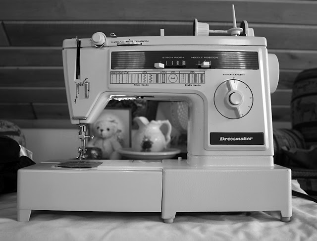
I introduce the "Dressmaker" my mom's trusty cast iron sewing machine, which I will steal from her someday when I have somewhere to put it.  The hardest part is when I don't use it for an extended period, I need to re-learn how to thread it.

When sewing:     {I also learned you can sew over your pins and remove them later}
I      {make sure your new seam is overlapping the old one, and is double stitched - front, back, front - at the ends and over the crotch seam}
II     {when done with a single tight stitch do a second round but about 3/8ths from the first one. The second one should be a loose wide stitch to hold the two fabrics together. *if confused just mimic what your existing pants look like}
III    {then cut the remainder of the fabric off so you don't have bunching inside when you wear them *you may want to do this after you have tried them on and decided to keep the new sewn marks}
IV   {turn them right side out and wear them}

I also attempted a new hem at the ankle cutting about 4 inches off, but it looks horrible- haha. Lucky for me these are black pants and tightly fitted so it's not noticeable.


I realized as I was getting my photos together I didn't take any of the sewing process and decided to get a final shot.

What a surprise! Taking your own photo without looking through a viewfinder or being able to adjust any settings, and being mostly in the dark.  But it does it's job and shows how nice they fit now!

Saturday, March 17, 2012

inspiration {singing frogs}

This week I decided to travel home for my dad's birthday.  He turned 48 but for some reason I keep thinking he's 58, since everyone I know has older parents. Well it just so happens that for his birthday this year, we have had an early spring, or summer - I'm not sure what season it is outside.  Today it was 80, along with a high string of 70's this last week. Because of the weather all the buds are starting to come out {the rose bushes, tulips, trees, chives, cherry tree, mint and the over growing ivy throughout our rock walls.}  

My parents live in a log cabin on 3 acres of wooded lot with a retention pond at the bottom.  In the summer the frogs croak at night, and it's really quite pleasant to listen to them with the cool breeze coming in the window as you sleep.  This season they seem a little confused and have non-stop croaked day and night very loudly! I still find it very refreshing to listen to at night, and it's a great change from cars and people outside in the city.  Let's not even mention the star gazing potential at home.

As the sun was setting this evening I took a little video of one off the side of our deck in the front yard + a few pictures.


my first attempt at HDR photos


I love the soft sunset colors


I discovered a massive spider web!


you can see it better here. it's about 20 yards from the deck and 3-4 yards wide/tall

Thursday, March 08, 2012

inspiration {aurora borealis}

This week's inspiration comes from nature and the beautiful colors in the sky. Both last night and today have been very exciting days to look for the beautiful colored photos.  I was really inspired and wanted to go "northern light hunting" this weekend.  Being in the city it's hard to get past the light pollution and the full moon we've been having.  But we've decided to wait till warmer weather and  go camping in Canada or near the boundary waters to find some this summer.  I hope to take some of my own pictures like this some day.

{As seen on flickr}

by *Jonina*

by timo_w2s

by Samantha Stuart

notes to friends

This week I put my pretty paper to good use and made hand-made cards for a few of my favorite people.  I'm pretty obsessed with yellow,gray, and dark blue for the time being as you can see in my cards.  I even got to the post office and mailed them out in a timely manner.  The next cards I'll be making are for birthdays.  This month alone I know of 8 people's birthday off the top of my head.  So happy birthday to all you March babies!


Friday, March 02, 2012

one year in south korea

Recently Andrew + I have been talking about making a giant {and probably very expensive} book of our time in Korea.  Most of you know already Andrew + I spent the last year being English teachers in a small town called Jinyeong.  It has been 4 months since we have returned, but it literally seems like a month ago.  We miss our Korean family and friends more than anything and our lifestyle of living together {although it was very small} and some Korean food like shabu shabu, san-gi-tal, + bo-kimbop.  If your more interested Andrew + I both did blogs while in Korea depicting our way of life, travels, teaching, etc.   {My blog}    {Andrew's Blog} 

As a going away gift to our Korean family {Kang, Choi, Xavier, William, + Henry} Andrew + I put together a few of our photos to make a book of the places + things we did together.  We wrapped it up and gave it to them as we sat down for our final meal before they took us to the airport to leave the country.  Since returning we both let our final trip to Jeju Island fall to the back burner - Andrew starting a new job, me making a portfolio and trying to find one myself.  But as I mentioned there has been new talks of revamping + making a new book.  I initially got very excited and wanted to start planning.  I enjoy designing Blurb books and wish someone would just hire me to make them all the time. I started sketching layout and design ideas, then remembered I hadn't finished editing my Jeju Island photos yet.  So the last two days, I powered through them and made a little icon palette using one picture for every set I uploaded of the last year, while in Korea. 35 sets > 35 thumbnails as a tribute of all our memories.  Needless to say I am putting "make a Korea book" on my list of projects.

Here are my final flickr sets: {lava tubes} {seogwipo falls} {sunrise peak} {lava rocks} + {collection: Korea}   


Thursday, March 01, 2012

where to start

I recently became really inspired to continue my blog from Korea, but didn't want to use the same one.  Blogger makes it easy to have more than one blog using the same name and what not. Last week I went through all the design templates and fonts and uploaded my portfolio cover for my background and got everything ready.  And now I've just been procrastinating because I wanted to document all of the design things I've been doing for the last 3 months, while unemployed. But I haven't so I decided today is the day I just start from fresh.  Someday I may add a photo or two of projects I have accomplished. But today is a new day.

This week I have done a little card exploration.  The photos I took weren't the best, using my IPad, but you get the gist.


The Thank You card is for a graphic designer that agreed to meet with me last Saturday morning for an informational interview.  She was very nice and down to earth.  She answered all of my questions and gave me some great perspective as to the graphic design industry and where I should start.  I asked her to meet with me because I feel we share a lot of the same tastes and hobbies.     Here is her website - l belle

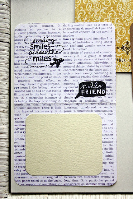
After helping shovel some very wet and heavy snow yesterday, Andrew's mom Vicki, and I went to Archiver's to use some coupons.  I got some really pretty paper to make some cards with and a stamp set "hello friend" that I am very excited to put to use.


The newly fresh snow was really inspiring.  Unfortunately I loaned my zoom lens out this same morning, but still captured how peaceful and heavy everything was after the loud windy ice-storm the night before. 

I feel this is a good start to my new blog. I have many projects I'm currently doing, but I can't give them all away just yet.

Happy March
- Manda Sue